 |
|
|
Depicted in Ink
Friday, 7 February 2014
Tuesday, 28 January 2014
depiction
| This was also a design I created for the film festival, however for this particular design I wanted to focus on incorporating the words within the image itself. |
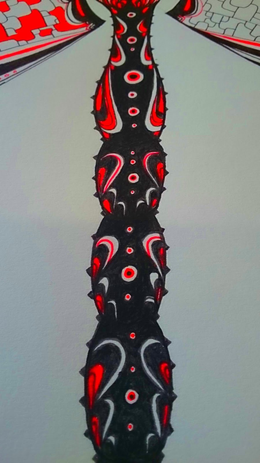
| These 'Dragonfly' mask designs were created to be used in my friends film project. When the final design was completed it was then transferred to an actual mask canvas. |
| This video shows what the finished product looked like on the actor who mainly uses the prop in the short film. |
Monday, 27 January 2014
The Mau Kun Map
For my graphics project I decided create a multi - functioning product. This final piece was composed with idea to use a range of influences, including Chinese art and art nouveau, in order to display a collision of two art forms. My final idea was to create a puzzle board which also functioned as a piece of interactive art. Using inspirations from the 'Pirates of the Caribbean' "Mau Kun Map', also known as the 'navigational charts, I took the idea of the individually rotating rings, which when aligned together created an image or phrase hidden within the puzzles design.
_edited.jpg) |
| By inverting the original colours of the map, the highlighted areas can be seen more clearly, giving the impression that the map has been x rayed. |
Colour was a very important aspect of the puzzles design, as it had to play the role of keeping the puzzle both interesting to look at and aesthetically pleasing.
These colour were mainly used in the puzzle board to section off natural areas of the map, these include forests and jungles. |
These tones of colours were included through out the final piece above, but were mainly used to create the terrain of the mountain ranges and land formations. |
| This is an example of how words can be overlapped on two different rings to hide them when the individual rings are turned. |
This was my first visual concept painting of the 'Mau Kun Map', although I stayed true to the use of water colour, this version of the puzzle/map does not actually rotate like the final product from above. This painting was mainly created in order to be used as a visual key to what the final design would look like. In terms of imagery, I focused heavily on the use of star charts and sailing maps to portray a sense of journey through the individual 'world' rings. I also used chinese script to name and separate different 'sectors' of the map, this created separate boundries between places and allows words and phrases to be cloaked with the chinese language.
This was my first prototype I created during the design process. I used water colour as the backdrop to each of the rotating rings, this gave each ring a sense of individuality while still maintaining the role of working as one finished product. Each ring rotates individually to reveal imagery and disguised words. Imagery that can be seen in this version of the puzzle/map are different countries, skulls, long boats, animals and star charts.
Subscribe to:
Comments (Atom)


